
A Freezer Pack Brief Built for Kimberley Heat and Cold Store Handling
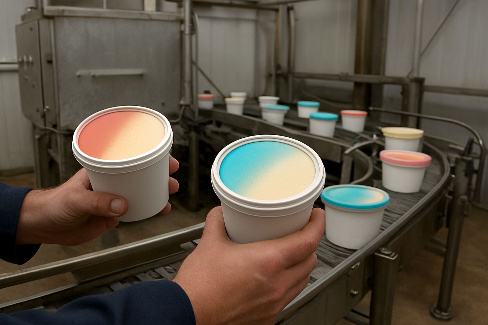
The brief came from a frozen dessert producer in Kimberley supplying tubs through independent grocers, wholesalers and foodservice outlets. The pack needed a lid graphic that would shift colour at low temperatures so the shopper could see a clear cue when the product had been in the freezer, while still looking bright and clean under retail lighting. The client also wanted the tubs to stand out in a crowded ice cream bay, without making the print too busy for a small lid format.
Because the tubs would move from cold store to display freezers and sometimes sit in mixed delivery loads, the print had to tolerate condensation, handling, and the usual scuffing that happens in a busy packhouse. Kimberley weather is dry for much of the year, but the product still goes through temperature swings and loading bay dust, so the coating and ink choice had to be practical, not just eye-catching. The target pack size was 1 litre tubs with 95 mm lids, printed for short-run seasonal flavour packs and repeat fills.
- Product type: ice cream tubs for frozen retail packs
- Lid diameter: 95 mm
- Artwork focus: colour-change cue plus flavour branding
- Use case: freezer display and cold-chain handling
Why Standard Colour Work Was Not Enough on This Job
The main constraint was temperature response. Ordinary lid inks would have given the design a flat look with no shopper interaction, so we tuned a thermochromic effect to activate at freezer range and hold its appearance after repeated door openings. The change had to be visible enough for the shopper to notice, but not so strong that it overwhelmed the rest of the brand panel. In simple terms, it had to feel playful and still look like a proper food pack.
We also had to work around the coating on the lid substrate. Some lids take ink well on the first pass, then become less predictable once the batch is die-cut and stacked. That meant doing adhesion tests, rub resistance checks and drawdowns before full production. We checked coating compatibility, because a lid that prints well in the lab can still show scuffing at the converters if the varnish is off or the surface energy is too low.
- Thermochromic activation tuned for freezer use
- Adhesion testing on the selected lid stock
- Rub checks for stacking and packing movement
- Coating compatibility reviewed before release
What We Supplied for the Lid Graphics Run
ThermoInk supplied a trial batch of colour-change ink, a matching security layer for authenticity marking, and a press-ready set of technical recommendations for the converter. Shaun October handled the practical press-side questions, while Nomfundo Khumalo led the colour matching so the printed result sat well with the ice cream range. Pieter van Wyk designed a subtle security pattern that could be verified by the client if needed, without disturbing the consumer-facing artwork.
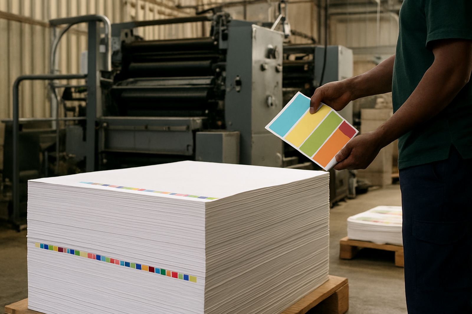
We ran drawdown panels first, then moved to a small trial batch to confirm the response under freezer conditions. Once that was approved, Lindokuhle Dlamini supervised production checks and Jason Pillay arranged the load plan so the material reached the converter in time for the seasonal pack window. The run also included batch retain samples, which the client kept as a reference for future reorders and any colour drift checks. That is useful when a pack runs again months later and the buyer wants the same look no matter who is printing.
- Colour Matching and Threshold Tuning
- Trial Batch Making and Drawdown Panels
- UV Verification Setups for security elements
- Batch Retain Library for repeat production
Timeline From First Samples to Approved Production
The project moved from first brief to approved production over 4 weeks. Week 1 covered the brief, substrate review, and initial colour target setting. Week 2 was for drawdowns and threshold testing in cold conditions. Week 3 covered trial batch making, press startup support, and pack-house feedback from the client. Week 4 was final sign-off and supply to the converter for full run planning.
The pace mattered because frozen seasonal packs cannot wait around while artwork decisions drag on. The client needed enough lead time to align tub filling, outer case packing, and delivery into the Kimberley distribution schedule. We kept the technical steps tight and practical, and the process worked well because everyone knew what had to be checked before release. No one wanted a lid that looked fine in the office and failed once it went into the freezer tunnel.
- Week 1: brief and material review
- Week 2: drawdowns and threshold tuning
- Week 3: trial batch and startup support
- Week 4: approval and production release
Results at Shelf and in the Cold Room
The finished lid design gave the client a stronger shelf read and a clear temperature cue that shoppers could understand quickly. Store staff also found the colour-change feature useful when explaining the pack to buyers during tastings and promotions. The added security print gave the range a more controlled look, which helped where mixed stock and seasonal specials are handled together.
From a production point of view, the run held up through filling, lidding, outer packing and cold storage without unusual rub-off or poor laydown. That saved the converter from rework and reduced the risk of hold-ups during a busy period. The client reported that the pack gave them better visual differentiation in the freezer cabinet, and the design held its appeal across repeat deliveries. For a pack with a lot of movement and a limited lid area, that is exactly what was needed. A good freezer pack should work hard without looking like it tried too hard.
- Clearer shelf recognition in mixed freezer cabinets
- Better shopper engagement with the colour-change cue
- Stable print through filling and cold storage
- Reduced rework risk during production
What We Would Repeat on the Next Run
If we were repeating this job for another Kimberley seasonal flavour, we would keep the same testing sequence and start with the lid substrate earlier in the process. That saves time when a pack has to meet a launch date before peak summer trade. We would also keep the security pattern light and practical, because too much detail on a small lid can make the artwork feel crowded. In packaging, less clutter usually prints better and reads faster.
For future runs, we would likely extend the retain library and keep a second threshold sample at the converter so any mid-season reprint matches the approved result. We would also recommend the same startup support on the first production day, especially if the line is running other frozen items in the same shift. That small bit of discipline helps avoid colour drift, nicks on the lid print, and last-minute packeging complaints that are easy to prevent with proper checks.
- Keep the same test order for repeat runs
- Retain a second approval sample at the converter
- Use startup support on the first shift of each reprint
- Review substrate early if the lid supplier changes
Key facts
| Client type | Frozen dessert producer in Kimberley |
|---|---|
| Pack format | Ice cream tubs with printed lids |
| Lid size | 95 mm |
| Ink system | Thermochromic colour-change ink with security pattern |
| Timeline | 4 weeks from brief to approval |
| ThermoInk services used | Colour Matching, Threshold Tuning, Adhesion Tests, Drawdown Panels, Trial Batch Making, Press Startup Support |