
Why chilled packs need clearer graphics
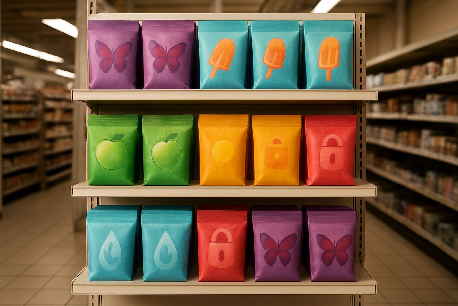
When a product moves through cold rooms, loading bays and retail fridges, the pack has to carry practical information that can be read quickly. A shopper may only have a few seconds to see whether the item belongs in a chilled cabinet, while a warehouse team needs to know how to store and handle it before the truck doors open. If the artwork is busy or the temperature cue is too faint, the message gets lost.
For South African packaging lines, this matters even more because product often moves between coastal humidity, inland heat and long road routes. In Durban, a pallet can leave Jacobs in damp morning air and still need to look sharp after a delivery run to Pretoria or Gqeberha. Graphics for cold chain packs should keep their colour shift, legibility and surface finish after that trip, not only on the press sheet.
- Make the chilled message readable from shelf distance.
- Use clear cues for temperature sensitive stock and handling.
- Keep the artwork stable through packing, transit and retail display.
Designing graphics that work in real handling conditions
Cold chain graphics should be planned around where the pack is touched, stacked and scanned. A label on a punnet, sleeve or carton does not live in a showroom. It sits under condensation, rubs against other packs and may be checked in a cold room with low light. That means the layout must stay simple and the message must survive moisture and handling.
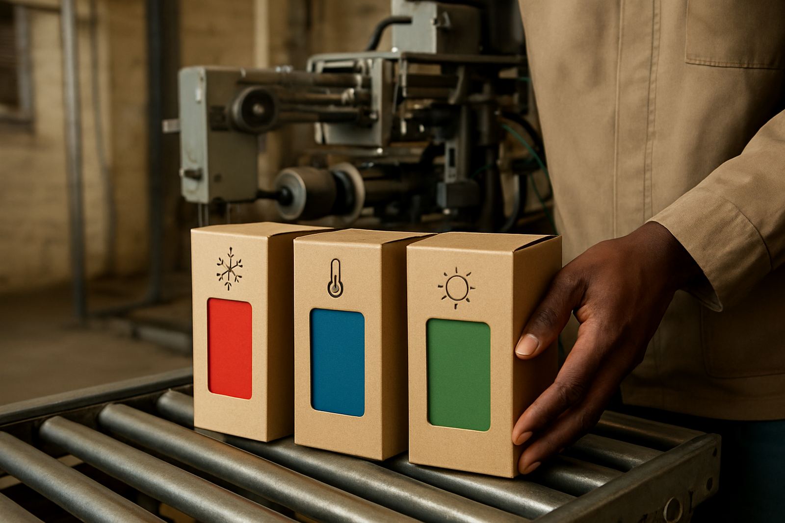
Colour change features can be used to show when a pack has reached a set temperature range or when it has been exposed to conditions outside the target window. Used well, this gives staff an immediate cue without needing extra labels or manual checks. The trick is to tune the visual response so it is obvious, but not so strong that it confuses the main pack graphics.
- Place the temperature cue where staff naturally look first.
- Avoid fine text near areas that may fog up with condensation.
- Keep contrast strong for cold room lighting and freezer aisles.
- Allow room for batch codes, trace marks and handling symbols.
What production teams should test before release
Before a chilled pack goes into full production, the artwork and ink system should be checked under conditions close to the real line. This means testing on the actual substrate, not only on plain paper. Film, coated board and laminated packs each behave differently, and a design that looks good on a sample print can fail once it hits the line speed or a cold storage cycle.
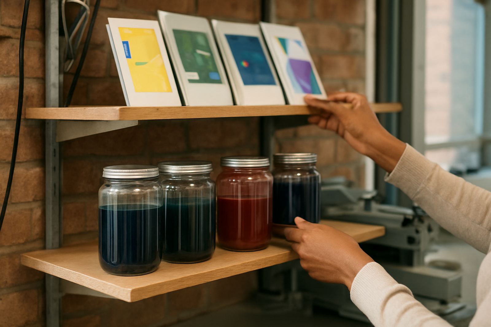
At ThermoInk, practical checks usually include drawdown panels, adhesion tests, rub resistance checks and threshold tuning so the colour response happens at the right point. If a graphic is meant to signal a chilled range of 2 to 8 degrees Celsius, the visual cue needs to trigger consistently, not early one day and late the next. That consistency helps both the packer and the buyer.
- Run trial batch making before committing to long production runs.
- Check coating compatibility with films, cartons and overprint layers.
- Use press startup support to confirm the first sheets match the agreed sample.
- Keep a batch retain library so later issues can be traced properly.
Security features that protect chilled products
Cold chain packs often carry higher value because the contents are perishable and time sensitive. That makes them a target for substitution, tampering and unofficial relabelling. Security inks can be used alongside temperature graphics to help confirm that the pack is genuine and still within the intended supply route.
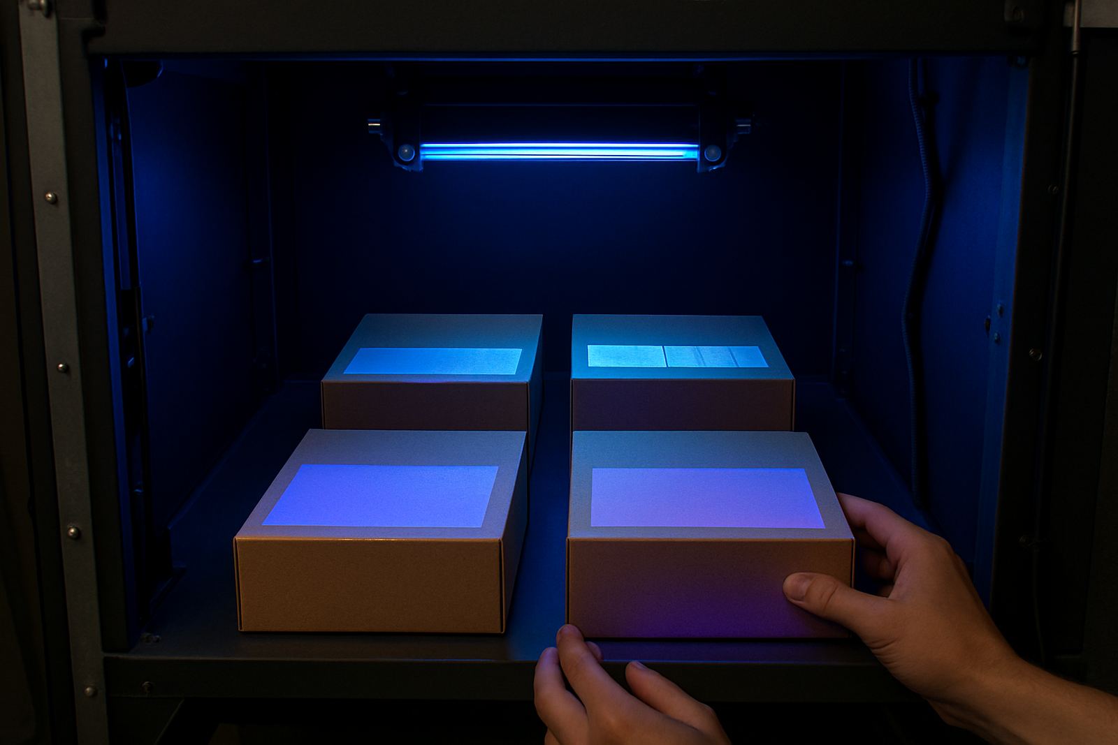
The value is not only about stopping fraud. It also helps protect brand trust. If a shopper buys chilled meat, dairy or nutraceutical stock and the pack looks altered, the concern is immediate. Security pattern design, UV verification setups and specialist ink selection can give converters a stronger way to protect the pack without making the front panel look cluttered.
- Use discreet security marks that are easy for trained staff to verify.
- Plan features that remain visible after refrigeration and condensation.
- Match the security layer to the converting process and coating system.
A Durban example: from Jacobs to national stores
A packaging converter in Jacobs might be printing cartons for chilled ready meals that move into KwaZulu-Natal stores, then onto routes for Gauteng and the Cape. The artwork has to support both the cold chain and the retail shelf. In practice, that means the chilled cue must read clearly on a busy loading bay in Durban, while still looking clean when the pack reaches a fridge in Johannesburg or Pinetown.
In a case like this, the pack team would often start with colour matching and drawdown panels, then move into rub testing and threshold checks. If the stock is being stored near the coast, the finish also has to cope with humidity and occasional water vapour in cold rooms. Small changes in coating or drying time can affect how the graphic holds up, so production troubleshooting is part of the process not an afterthought.
That is why local support matters. When the converter needs a quick change to suit a carton board, sleeve or label format, having a team based in Durban and supplying nationwide cuts down wasted time and rework.
Keeping the message clear from factory to fridge
Good cold chain graphics are practical first, decorative second. They should tell the right people what the product needs, at the right moment, without extra explanation. When the pack is designed properly, the chilled cue, the handling marks and the security elements all work together. The result is a pack that travels well, scans well and sells well.
For converters and brand owners, the best starting point is a clear brief: what temperature range matters, where the pack will be handled, what substrate is being used and which checks are needed on line. From there, the ink system and artwork can be matched to the real job instead of forcing the pack to fit a generic print solution.
- Define the temperature cue and where it must appear.
- Test the graphic under cold, wet and high-speed handling conditions.
- Choose security features that support authenticity without crowding the layout.
- Review the final sample in the same lighting as the end user will see it.