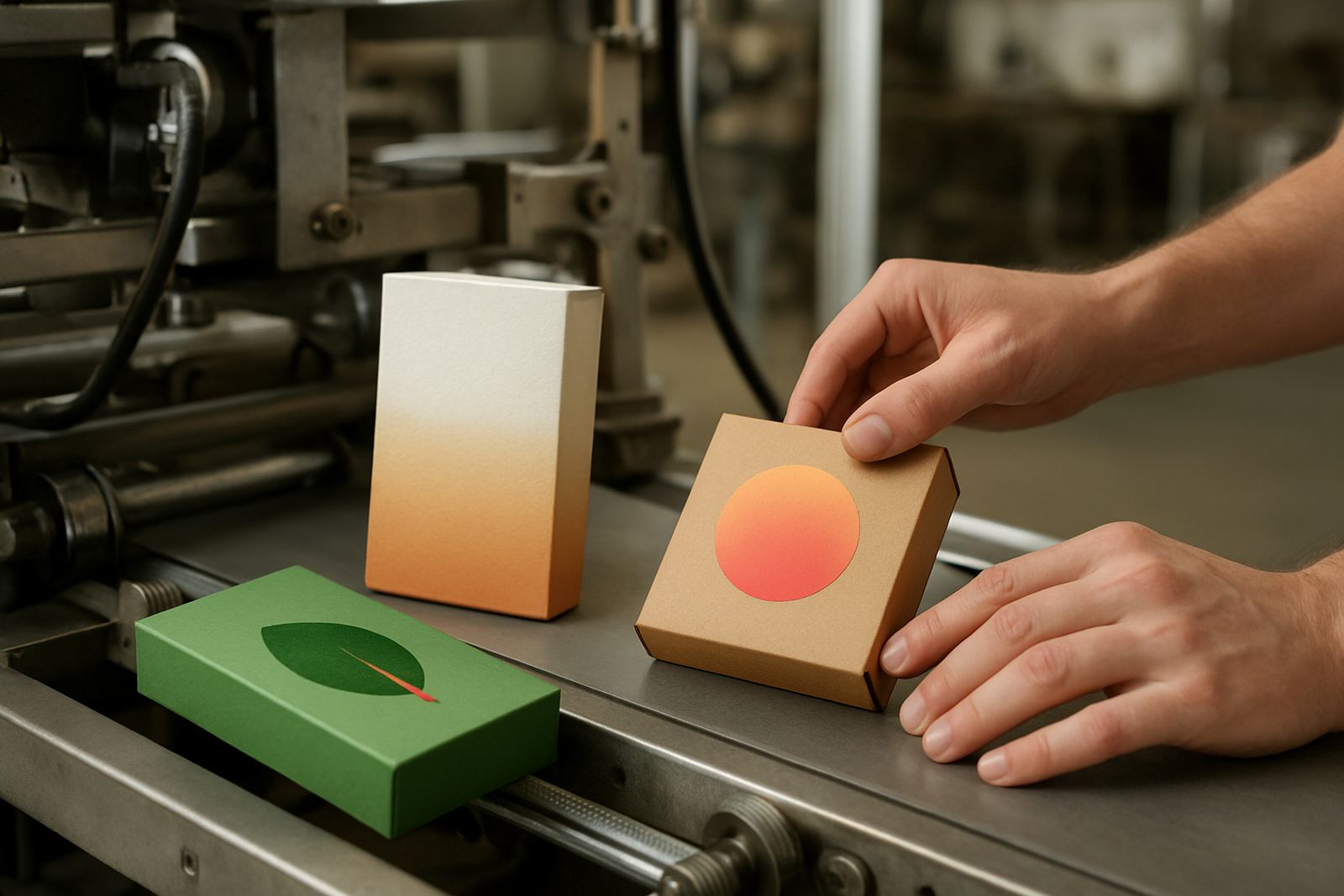

Why shelf impact has to earn its place
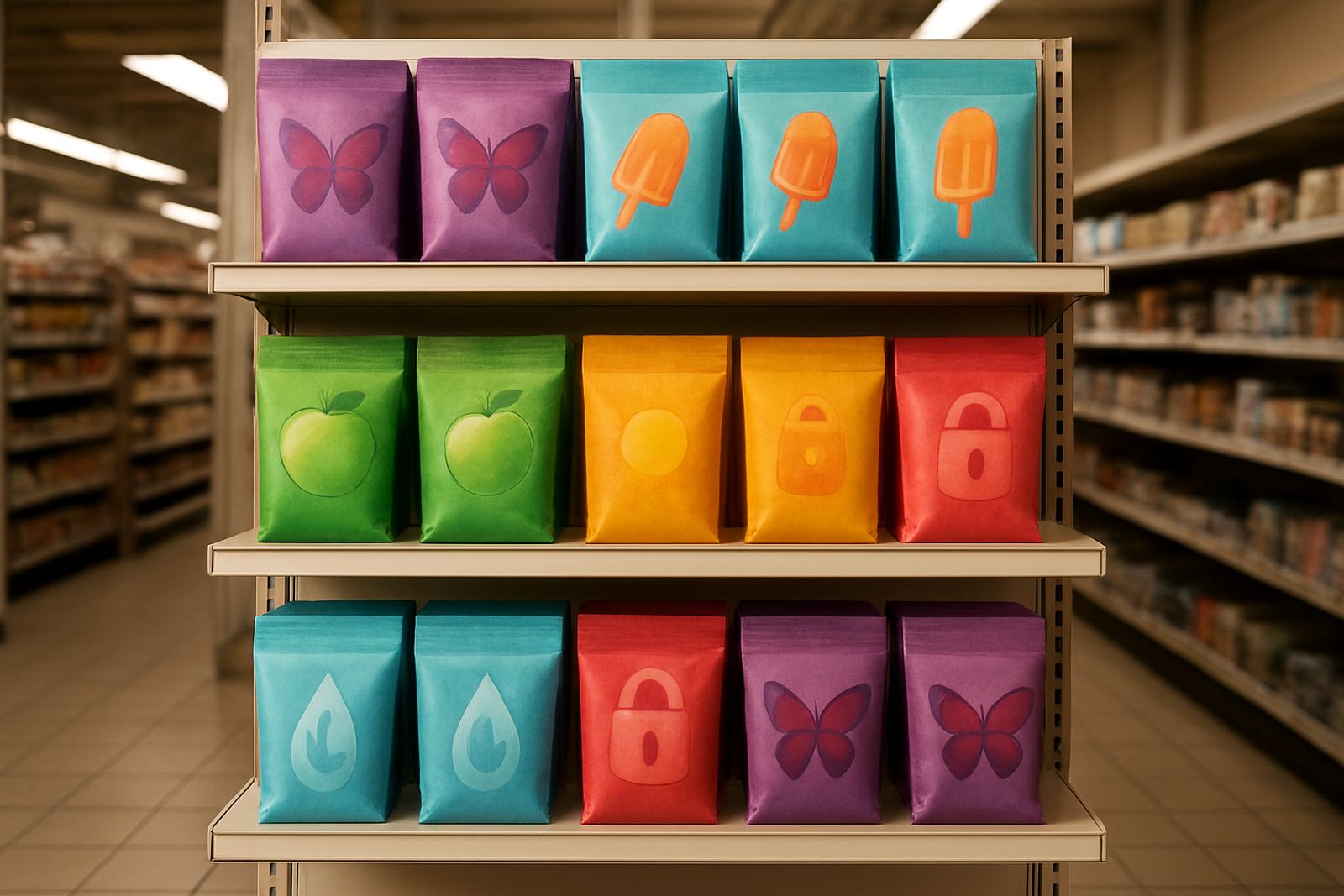
In packaging, colour and finish are not only about looking good. A carton or label has to stand out in a crowded aisle, but it also needs to tell the buyer something useful. That can be as simple as showing a temperature shift, a sealed pack indicator, or a visible security mark that confirms the pack has not been interfered with. When those details are built into the print system from the start, the pack does more work without adding extra clutter.
For South African converters, this matters because retail conditions vary so much. Products may sit in a warm warehouse in Durban, travel through summer heat to Gauteng, then land in a fridge store in Cape Town. If the packaging only looks impressive under ideal light, it loses value fast. Function gives the design a reason to exist, and that is where thermochromic and security inks pull their weight.
Turning temperature cues into practical pack guidance
Thermochromic inks change appearance when a product reaches a set temperature range. That gives the consumer a simple visual cue without needing a complicated instruction panel. It can be used on food packaging, chilled items, personal care packs, or promotional cartons where handling conditions matter. The aim is not to replace proper storage, but to make the pack more helpful at a glance.
In practice, the key is setting the right threshold. Too low and the pack changes colour before the product is actually ready. Too high and the cue arrives too late to be useful. At our Jacobs base, threshold tuning is often the first step because Durban’s humidity, coastal heat and warehouse conditions can affect how a print behaves on different substrates. A pack that tests well in a lab still needs to perform during transport, stacking, and retail handling.
- Choose the trigger point according to the product use, not only the print effect.
- Test on the final board, film, or coated substrate before running full quantities.
- Check how the colour shift looks under store lighting and daylight.
- Allow for real handling, including cold chain movement and touch contact.
Security features that fit cleanly into the artwork
Security printing should not make a pack look busy or difficult to read. Done well, it sits inside the artwork and supports the brand without shouting for attention. That can include hidden patterns, verification marks, or layered effects that are easy to apply during production but harder to copy later. For packaging converters, the value is in making the pack harder to imitate while keeping the design clean on shelf.
We often see the best results when security elements are planned alongside the colour layout, not added at the end. If the brand panel, batch area and verification zone are all mapped early, the final result is tidier and more practical for line operators too. It also helps when customers need a quick check during distribution or on receipt at a retail site.
- Use repeatable security patterns in areas that will not interfere with nutrition or regulatory text.
- Keep verification marks where staff can inspect them quickly during receiving.
- Match ink and substrate choices to the actual print line speed.
- Build in a retain sample system so production records are easy to trace later.
What makes a pack work across different South African routes
One of the biggest mistakes is designing for a single factory setting and forgetting the rest of the journey. A product may be packed in Pinetown, stored briefly in Prospecton, moved by road to Johannesburg, then handed over at a retail DC in Pretoria. Each step changes the strain on the pack. Heat, rubbing, stack pressure and repeated handling can all affect how a speciality ink behaves.
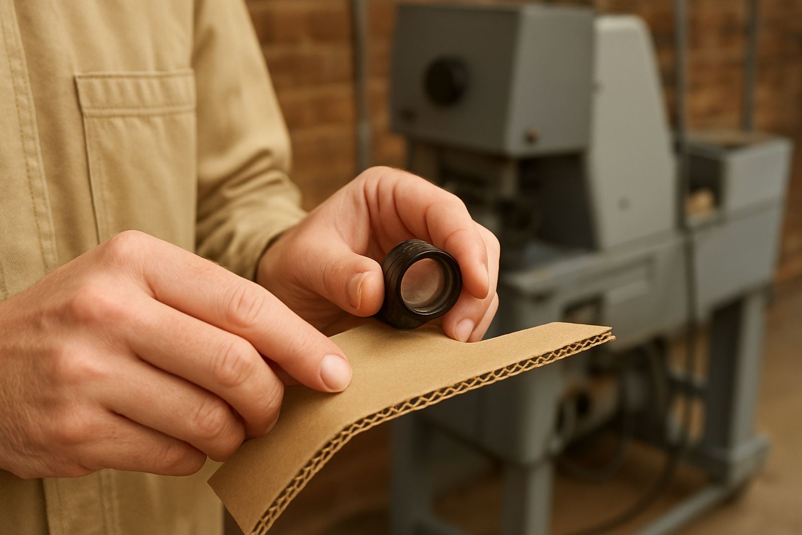
That is why we look at adhesion, rub resistance and coating compatibility before a full run is signed off. If the ink is right but the lacquer or board is wrong, the system will still fail. Production support matters here because many problems only show up once the line is running at speed. A pack that looks perfect in a drawdown panel may behave differently once folded, glued, and packed into cartons. It is a practical issue, not a theory one.
For converters supplying both local and national clients, the safest approach is to test against the real route. Durban humidity, inland dryness, and time in transit can all expose weak points, so the trial should reflect the actual journey, not just a clean sample on a table.
A Durban example: small visual cues, clearer consumer trust
Consider a chilled beverage pack going out of Jacobs to stores along the coast and inland. The client wants the pack to look sharp on shelf, but also needs a simple temperature cue for the customer. A thermochromic window can show when the product has reached a preferred chilled range, while a discreet security mark helps the retailer and distributor confirm authenticity. The result is not just a prettier carton, it gives the shopper a reason to trust the product before opening it.
In that kind of project, the process usually starts with a drawdown panel, then a trial batch, then press startup support on the production line. From there, the team checks how the colour change reads under real store lighting and whether the print survives rubbing during packing and delivery. Small adjustments at this stage can save a lot of waste later, especialy when the pack is going into volume production.
For a local producer in Durban, that mix of shelf presence and function can make the difference between a pack that is noticed and a pack that is actually useful.
Getting the print spec right before you commit to volume
Speciality inks are best treated as part of the production spec, not as a last-minute feature. Once the substrate, coating, press speed and finishing method are known, the print team can tune the system properly. That is where colour matching, batch retain records and troubleshooting become part of the value, because they help keep results consistent from the first trial to the final cartons.
For South African packaging converters, the practical checklist is straightforward.
- Confirm the final substrate and coating before approval.
- Test adhesion and rub resistance on production samples.
- Verify the colour change under the lighting used in stores and depots.
- Keep retain samples for quality checks and future reprints.
- Plan the security feature placement so it fits the artwork and the filling line.
When all of that is in place, the pack does more than attract attention. It carries useful information, supports product confidence, and gives the brand a cleaner route from pressroom to shelf.