
Why responsive packaging is getting more attention
Interactive packaging is no longer just about a clever effect on shelf. In South Africa, brands are using colour changing and security features to solve everyday problems such as temperature control, product tampering, batch traceability and faster consumer recognition. That matters in food, pharmaceuticals, cosmetics and speciality goods where the pack must do more than carry a label.
The key shift is practical. A pack that changes colour when a chilled item warms up can help staff and customers spot a problem early. A hidden security pattern can make copying harder. And when both effects are built into the print process, the pack still looks neat, consistent and ready for high-volume runs.
What brands are using today on real packs
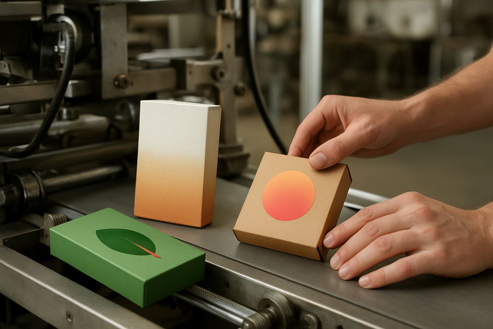
Current packaging trends are less about gimmicks and more about functional print. The most common uses we see are temperature indicators, authentication marks, hidden patterns and colour effects that respond to handling or storage conditions. These features can be applied to cartons, sleeves, sachets, labels and overprints, depending on the substrate and end use.
- Temperature cues for chilled or heat-sensitive goods
- Authentication marks that are visible under inspection or UV verification
- Pattern shifts that help distinguish genuine product from copied stock
- Brand accents that add shelf appeal without changing the main artwork
The trick is to match the effect to the pack’s job. A premium cosmetic carton needs a different finish from a meat tray label or a pharmaceutical carton, and the ink must hold up under folding, glue lines and transport. If the line is not tested properly, the effect can look good on press but fail in distribution.
How to plan interactive print without slowing production
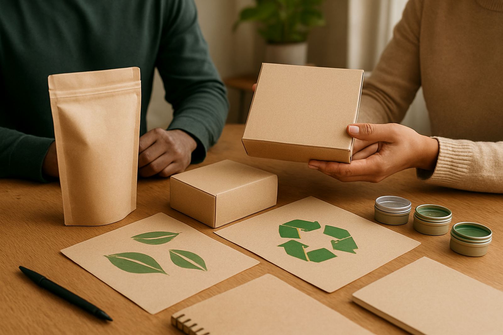
For converters, the first step is not the artwork. It is the process. Start with the board, film or coated stock you already use, then check whether the ink bonds well, dries within your line speed and stays legible after handling. A small trial batch is often better than jumping straight into a full order.
On busy production lines, even a small shift in drying time can create problems. That is why threshold tuning, adhesion tests and rub resistance checks matter before a live run. If a pack will travel through humid Durban conditions, or sit in a warehouse in Gauteng with heavy summer heat, the result must still read properly by the time it reaches the customer.
- Confirm the substrate and coating before artwork is signed off
- Test drying speed against your press speed and stack height
- Check whether the effect survives folding, cutting and packing
- Keep a retained sample from each approved batch for later comparison
Security printing is now part of brand presentation
Security features are often thought of as hidden marks only a factory team will see. In practice, they can also support the brand story. When a customer notices a shift in colour, a coded mark or a verification pattern, the pack signals that the product is controlled and properly made. That builds confidence without adding extra stickers or bulky seals.
For South African markets where grey imports and copied packaging can be a problem, this is especially useful. Security ink design should be planned with the packaging team, the production team and the commercial team at the same time. That way the mark fits the layout, the print process and the budget. It is much easier to build in early than to fix later, once artwork has already gone to plate.
Local conditions can change the result
Packaging trends only work if the print survives local conditions. Coastal humidity in Durban can affect drying and storage, while inland heat and load shedding can interrupt press schedules and change how inks perform between shifts. Municipal waste rules also matter, particularly where converters are managing cleaning residue, wash-up material or rejected test sheets.
That is why local support matters. A converter in Jacobs may need different handling advice from a packer in Pinetown or a carton line in Prospecton. When trials are done with the actual production team and the actual substrate, problems show up early instead of after a full dispatch run. It saves time, and a fair bit of money too.
What to ask before you commit to a new effect
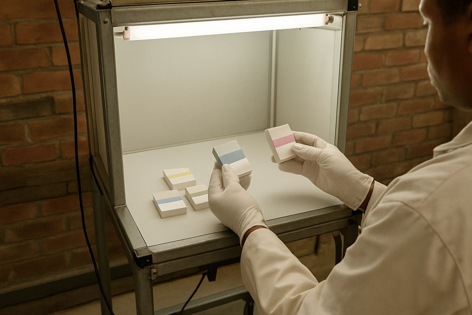
Brands often like the look first and ask the process questions later. The better order is to ask how the effect will behave in production, transport and retail display. A good supplier should be able to support colour matching, press startup, coating compatibility checks and production troubleshooting from the start.
- Will the effect still work after lamination or varnishing?
- Can the ink be matched to our existing brand colours?
- What happens if the line stops and restarts during a long shift?
- Is the security feature visible enough for field checks but not easy to copy?
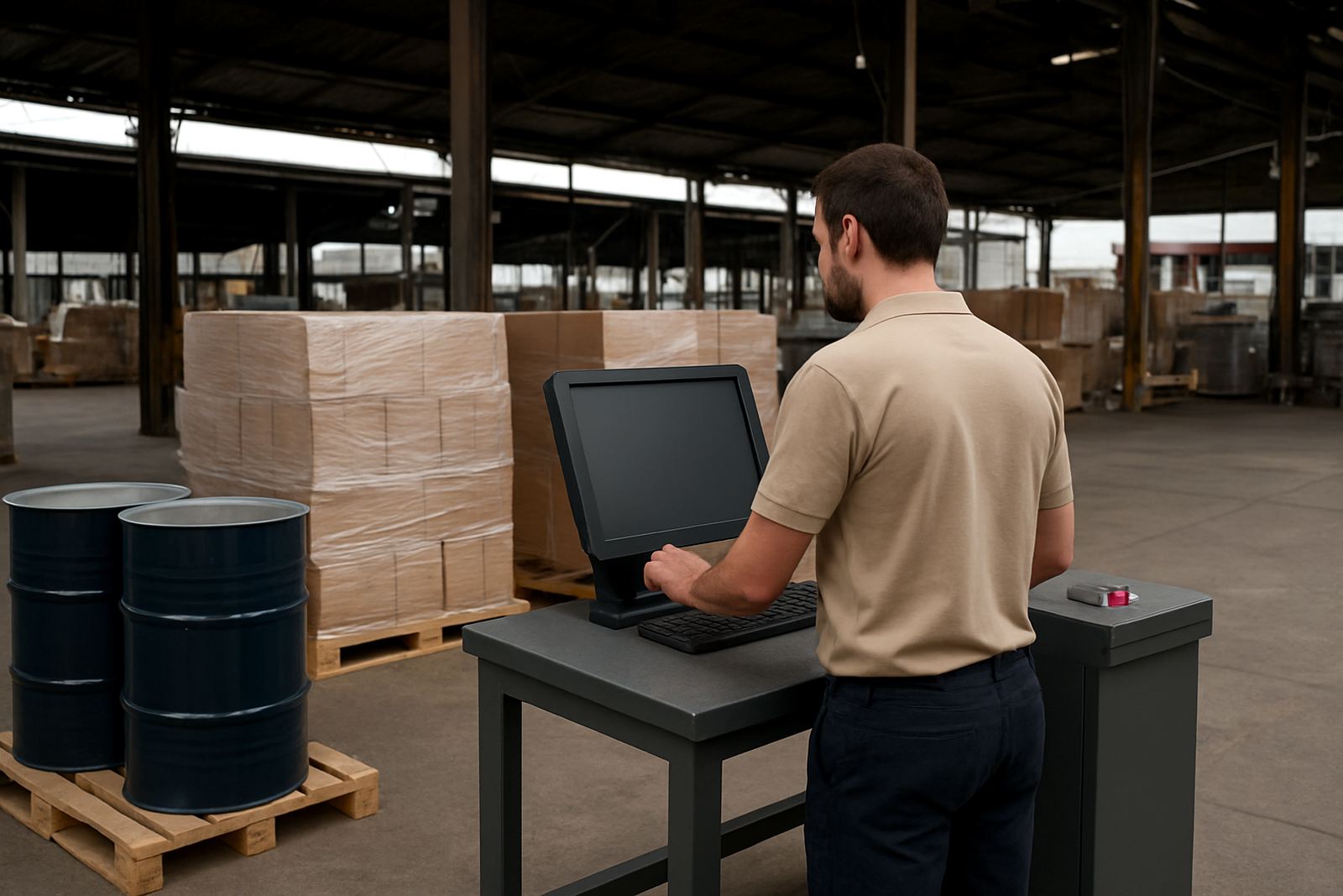
For Durban converters supplying nationwide, this approach helps keep repeat jobs consistent. Once the approved setup is recorded, later batches can be compared against the same retained sample and the same tolerances, so the pack stays familiar to the customer even when the order moves from one region to another.
A practical example from the Durban supply chain
Consider a packer in Durban South supplying temperature-sensitive goods to retailers in Gauteng and the Western Cape. The carton needs a colour cue that changes if storage conditions drift, plus a security mark that supports authenticity checks at distribution level. The converter uses a trial batch, runs rub resistance checks, then confirms the effect under UV verification before moving to production.
Once the line is stable, the same setup can be supplied through Jacobs, Prospecton or Pinetown without changing the pack’s core look. That is the real value of interactive packaging in South Africa: it is not just about visual interest, it is about making the pack work harder from factory floor to shelf.
Where the category is heading next
Interactive packaging is likely to keep growing where product safety, traceability and consumer trust matter most. Expect to see more packs that combine colour response with hidden authentication, especially on premium food, health and personal care lines. The strongest applications will still be the practical ones, where the feature is easy to understand and simple to repeat at scale.
For brands and converters, the opportunity is clear. If the print can help the customer make a better choice, help the warehouse spot a problem, or help the retailer confirm authenticity, then it is doing useful work. That is the direction this category is moving, and it suits South African production conditions well.