
Why colour approval shifts when the light changes
Packaging colour is not judged in one perfect moment. It is judged in a warehouse, on a flexo press, in a pack house, under office fluorescents and then again in retail lighting. If those light sources differ, the same ink can appear warmer, duller or greener than expected. That is a common reason for rejected batches and wasted print time.
For thermochromic inks the risk is even higher because the visual cue is part of the product function. A panel may look correct at room temperature but the trigger point can seem off if the approval room is too hot, too cold or too bright. In Durban, where humidity changes quickly and the air can stay warm after a wet spell, small shifts in surface temperature can throw off first impressions. That is why colour decisions must be tied to a fixed standard, not to whoever happens to be standing closest to the sample.
What good viewing conditions actually look like
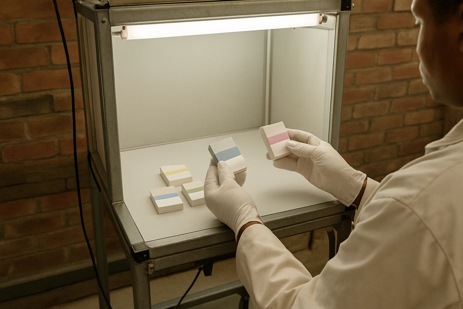
When a converter approves packaging colour, the test area should be controlled as far as practical. It does not need to be fancy, but it does need to be repeatable. A bright window next to the sample table is not a controlled viewing condition, and neither is a bay door open to the afternoon sun.
- Use a neutral surround so the sample is not influenced by coloured walls or artwork.
- Keep the viewing light consistent, with the same lamp type every time.
- Avoid direct sunlight, especially on metallic or glossy substrates.
- Let samples settle to the same temperature before checking thermochromic response.
- Compare against a retained reference panel, not memory.
For packaging converters in Jacobs, Prospecton or Pinetown, this matters on the floor where load-shedding can change the light source halfway through a shift. A colour that passed before the outage may not read the same once the room lights come back on, so the approval needs to be repeated under the same conditions.
The practical risk for packaging converters
When the view of colour is inconsistent, the problems show up later in the chain. A brand owner may reject a trial batch, or a packer may stop a line because the printed panel does not match the signed-off sample. If a security feature is involved, the issue is worse because the ink needs to be seen clearly by staff, inspectors and sometimes end users.
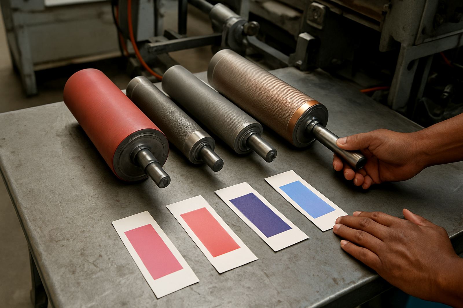
In practice, the biggest losses come from small things that are easy to miss. A coating can change the way a colour reads. A substrate with poor absorbency can make the same pigment look flatter. Even a slight change in the press speed can alter the laydown and make the shade appear different. That is why colour approval should be linked to production conditions as closely as possible, with notes on substrate, drying time and lamp type.
- Batch drift from one run to the next
- Rejected samples after a late-stage shade dispute
- Confusion when a heat-sensitive feature triggers too early or too late
- Higher waste when approvals are done in a different room from production
How ThermoInk checks colour before it reaches the press
At ThermoInk, colour approval is treated as a working process, not a single sign-off sheet. The team uses drawdown panels, threshold tuning and adhesion tests to see how the ink behaves on the real substrate. That helps identify whether the issue is the colour itself, the coating beneath it or the way the press will handle the job.
For packaging that needs a colour-change cue, the response point has to be checked against the intended use. If a chilled product should show a clear visual shift when it warms, the ink must trigger at the right level and hold that response long enough for the customer to notice. If a security layer is involved, the pattern must still be readable after rub resistance checks and UV verification setups. Those checks are only useful when the viewing conditions stay fixed.
Sibusiso Mthembu and the production team work with converters to trial a batch before full production. That can save time for a Durban packer running cosmetic cartons, or a Johannesburg converter handling labels for temperature-sensitive goods. The process is simple: make the sample, inspect it under the same light, record the result, then keep a retained panel for future reference.
A Durban example: why the same sample can look different at Jacobs and on site
Imagine a converter in Jacobs preparing packaging for a food client with cold-chain stock. The approval sample is checked in the morning, when the room is cool and the light is steady. Later, the same panel is viewed near a roller door after the afternoon heat builds up. The shade seems slightly different, and the thermochromic feature appears to activate sooner. Both observations are real, but only one is useful for approval.
This is where practical controls matter. If the sample is approved in Jacobs, then the same light and temperature conditions should be used for follow-up checks in Pinetown, Prospecton or Cape Town. For nationwide deliveries, Jason Pillay and the logistics team also make sure the retained references travel with the right batch details, so every site is comparing like with like. Without that discipline, the same ink can become a source of arguments instead of a clear quality check.
How to keep approvals consistent across sites
Most colour disputes can be reduced with a basic routine that every shift can follow. It does not need special language, just clear steps and one standard place for viewing samples.
- Agree on the light source before the job starts.
- Record substrate type, coating and drying conditions.
- Keep a retained sample library for repeat orders.
- Check samples at the same temperature each time.
- Use the same reference panel when production moves between plants.
Nomfundo Khumalo’s colour lab work is especially useful here because a good reference is only useful if it stays available and properly labelled. Lindokuhle Dlamini and Shaun October often support converters during press startup, which is when a small shift in colour can be corrected before the run gets too far. Pieter van Wyk also looks at the security side, so a feature that protects authenticity still reads clearly after handling, folding or transit. That combination of controls is what keeps packaging approval practical, not theoretical.