
George brief: a premium carton with a discreet trigger
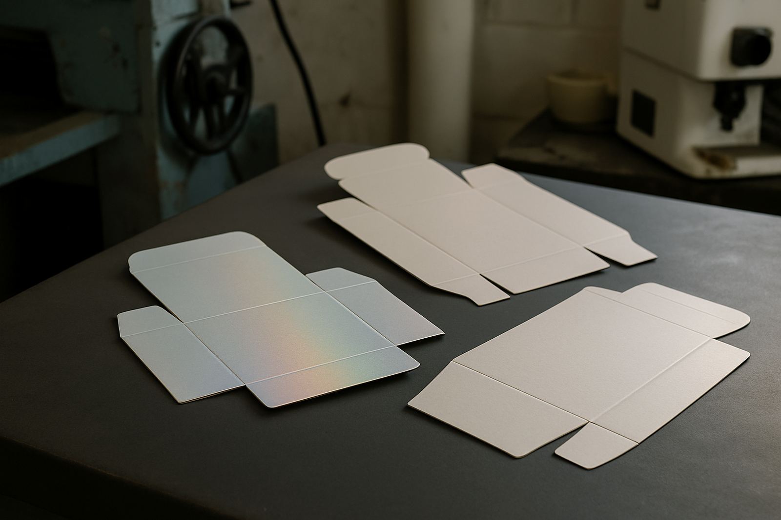
The client was a cosmetic packer in George supplying retail and salon channels across the Western Cape. They needed a carton range for skincare sets and gift packs that looked refined on shelf, but still gave the end user a clear functional cue. The main ask was a soft colour change on selected panels, plus a security feature that could help confirm authenticity on higher value packs.
The brief called for a finish that felt premium in hand, worked on short and medium carton runs, and stayed consistent across different carton sizes. The packaging had to survive normal handling in distribution, including stacking in warm stores and some coastal humidity on the route between George, Cape Town and inland depots.
- Carton format: folding cartons for cosmetic kits and retail packs
- Print run: mixed volumes, from short launch lots to repeat production
- Substrate: coated carton board with standard finishing varnish
- Effect required: subtle touch response, not an overly bright novelty look
What held the job back at first
The main constraint was that the client wanted the special effect to sit inside an existing carton process, not force a full rework of the line. That meant the inks had to suit the board, the overprint varnish and the drying time on their press. There was also a practical issue with scuffing during folding and packing, so rub resistance had to be checked early.
Because the cartons were for cosmetic use, the artwork also needed a clean colour match across multiple SKUs. A change in base tint on one carton could make the range look mismatched on shelf, so the colour work had to be controlled closely. The team in George also wanted a format that could be repeated without a lot of operator guesswork, especially when production was under time pressure.
- Need for stable colour across several carton artworks
- Resistance to scuffing during folding and carton insertion
- Compatibility with finishing varnish and board coating
- Simple press setup for repeat orders later on
Ink development, testing and press setup
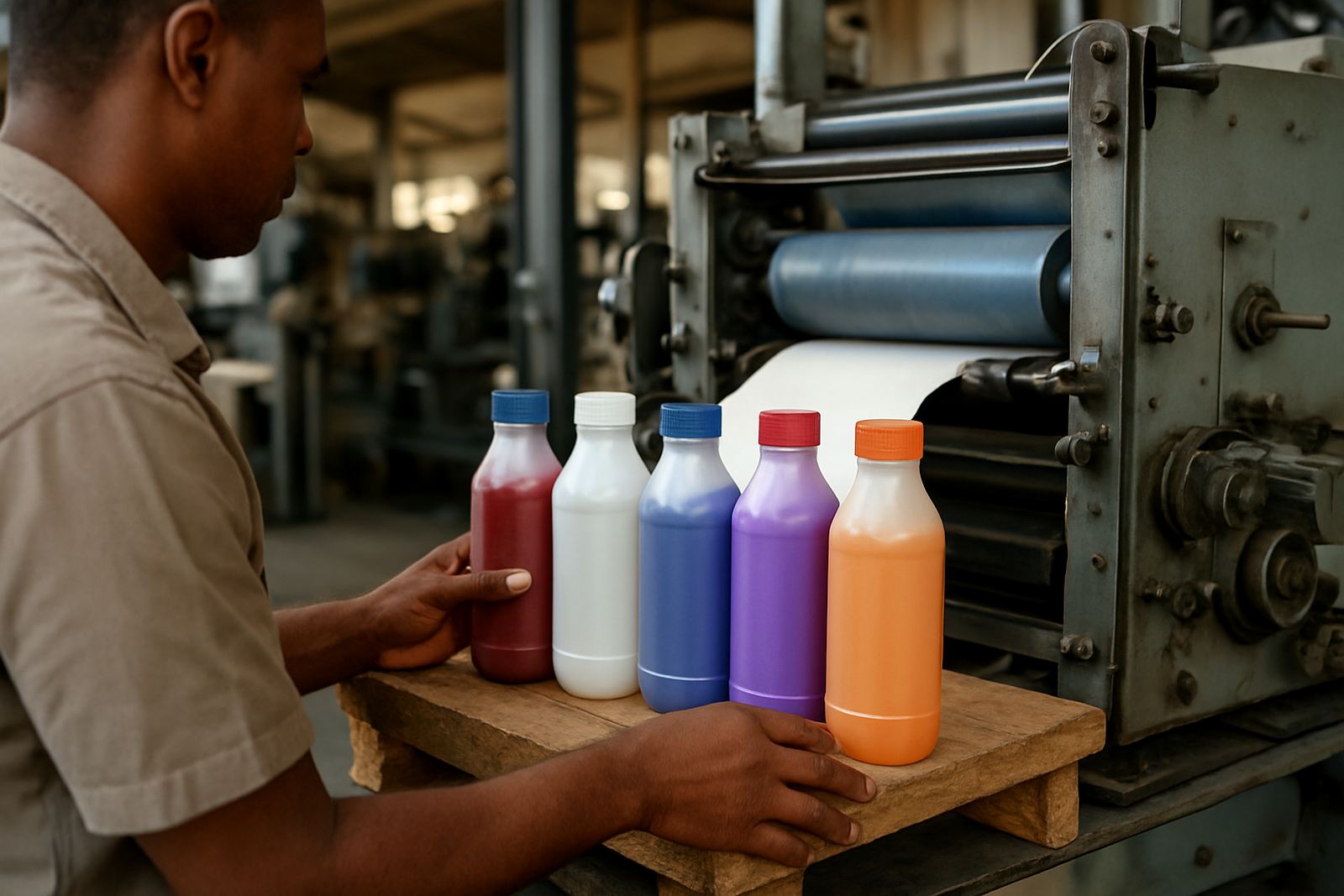
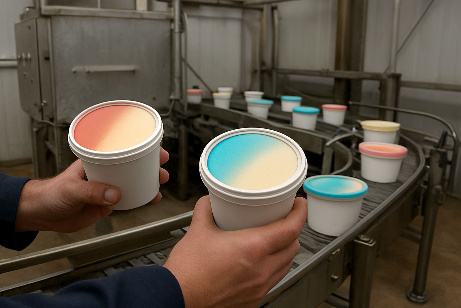
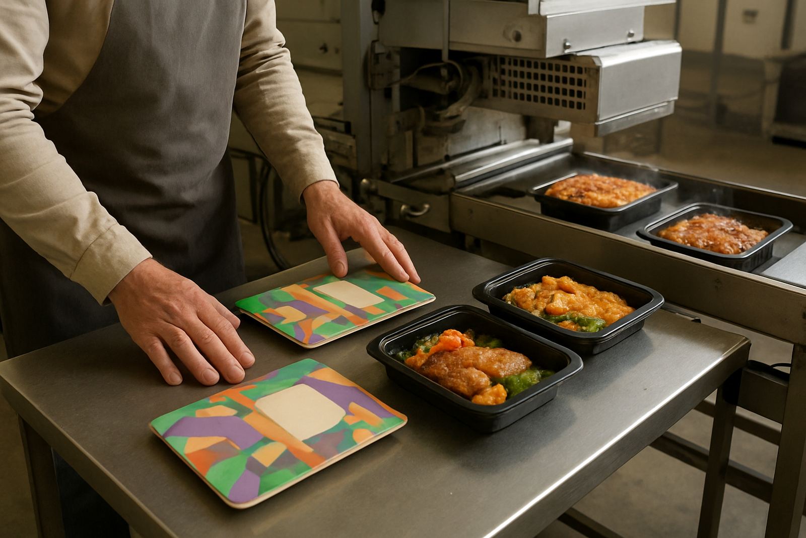
We started with colour matching and threshold tuning, then moved into drawdown panels to check how the thermochromic response would behave on the chosen board. The security element was designed to be discreet, with a pattern that supported authentication without dominating the artwork. Nomfundo Khumalo led the colour lab work, while Pieter van Wyk handled the security ink setup and verification method. Shaun October supported the customer on press-side questions, and Lindokuhle Dlamini checked the production side for batch consistency.
Once the initial samples were approved, we ran trial batch making and press startup support over a three week development window. Adhesion tests and rub resistance checks were done before the client locked the final carton spec. We also set up UV verification for the security feature so the packer could check the response quickly during production and later in the supply chain. The line was not ideal for long stoppages, so Jason Pillay coordinated deliveries and timing to keep the sample cycle moving.
- Colour matching against approved artwork references
- Adhesion tests on the selected coated carton board
- Rub resistance checks after overprint finishing
- UV verification setup for the security feature
The finished carton system and key facts
The final carton range combined a soft touch visual feel with a controlled thermochromic response on selected icons and indicator areas. That gave the pack a premium look on shelf, while the temperature cue helped the end user understand handling conditions for sensitive cosmetic items. The security pattern was placed in a low-noise area of the artwork so it could be checked without changing the front face too much.
The client also asked us to keep retain samples on record, which we handled through our batch retain library. That gave them a reference point for future repeat orders, especially useful when smaller print runs come back months later. The final spec was set up so the converter could run it again with less setup time and fewer corrections. It also meant the range could be adapted for seasonal gift packs without starting from scratch.
- Thermochromic cue on selected carton areas
- Security pattern design with UV checking
- Suitable for coated folding carton board
- Repeatable reference retained for later production
Results on shelf and in the packhouse
The result was a carton range that looked sharper at retail and gave the customer a clear functional marker in use. The premium finish helped the client position the products at a higher shelf level, while the subtle touch effect avoided the overdone look that some cosmetic packs fall into. In packhouse handling, the cartons held up well under normal folding, packing and distribution.
From a production point of view, the biggest gain was consistency. Once the press team had the setup notes and verified thresholds, the run became much easier to repeat. The client reported fewer stoppages around colour drift and less uncertainty around the security check. For a cosmetic range moving between George and larger distribution points, that mattered because packaging errors can create delays very quickly, especially when stock is already booked for stores.
- Cleaner shelf presentation for premium cosmetic lines
- More consistent repeat running after first approval
- Better handling performance during folding and packing
- Clearer authenticity checks for higher value packs
What we would repeat on the next cosmetic run
If we were doing the same job again, we would keep the same early sample path: colour matching first, then threshold tuning, then rub and adhesion testing before full production. That order saves time and keeps surprises out of the press room. We would also keep the security feature simple enough to verify fast, but specific enough to support anti-counterfeit checks.
For cosmetic cartons in South Africa, the practical lesson is that special effects must still behave like production ink. They need to print cleanly, dry properly and survive transport, whether the goods are going to George, Cape Town, Durban or inland depots. In this case the balance was right, and the client ended up with a carton range that looked refined without creating extra trouble on the line.
- Start with drawdowns before full batch work
- Keep the security cue low profile but testable
- Plan around the actual press and drying limits
- Hold a retain sample for every approved version
Key facts
| Project | George cosmetic cartons |
|---|---|
| Town | George, Western Cape |
| Timeline | 3 weeks from sample to approved production setup |
| Special features | Thermochromic cue plus security pattern |
| Substrate | Coated folding carton board |
| Support supplied | Colour matching, trial batch making, press startup support, UV verification |