
Why an on-pack cue must be easy to read
Shoppers do not stand in a shop aisle with time to decode a complicated label. If a colour change, icon, or security mark is meant to tell them something important, it must be understood in a few seconds. In South Africa that matters even more because packs move through hot loading bays, cold rooms, coastal humidity in Durban, and long distributor routes. A message that works in a studio but fails in a store is not good enough.
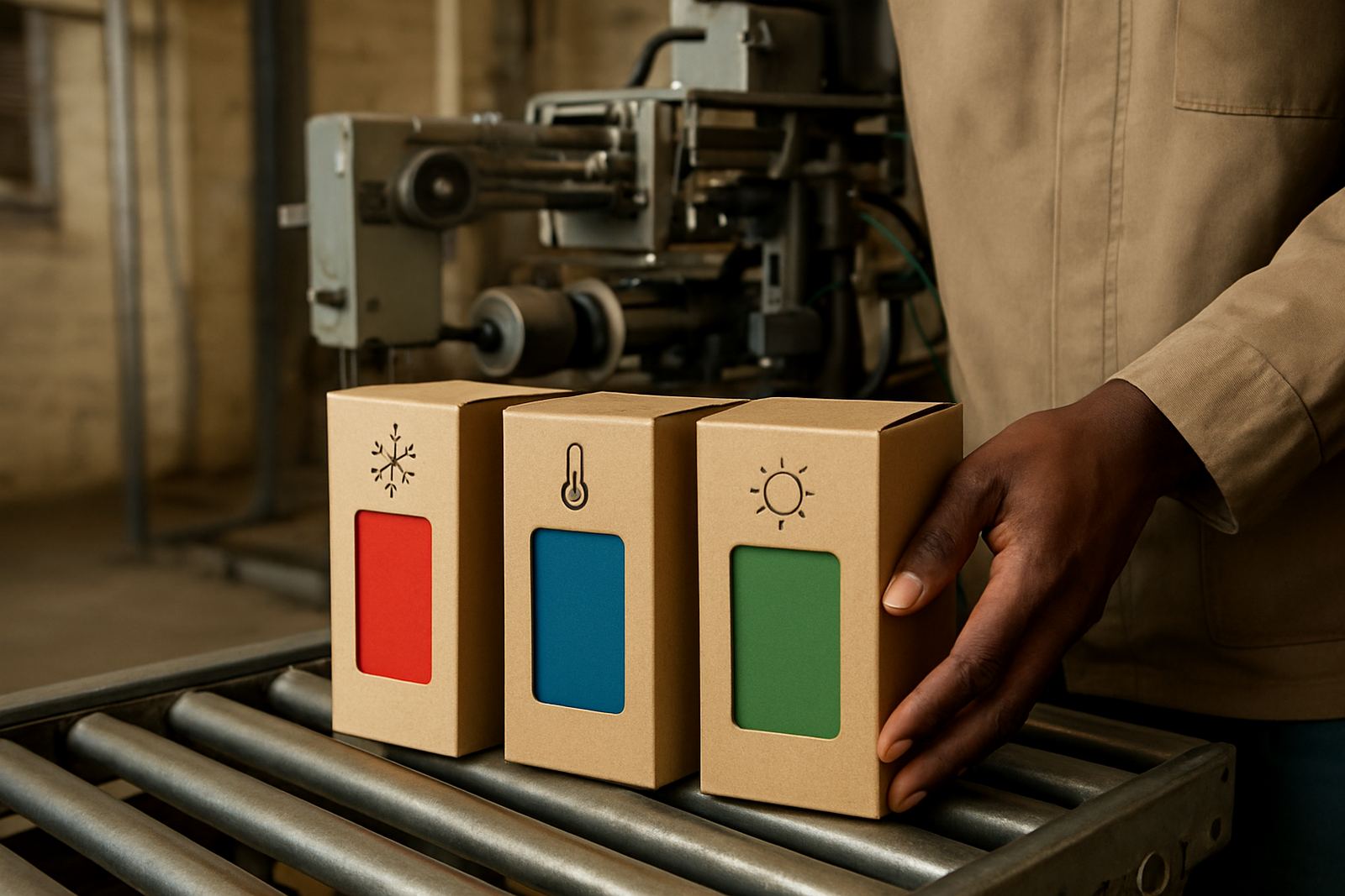
The best on-pack education is simple, direct, and repeated in the same place every time. If the cue says a chilled item has warmed up, the shopper should see the same instruction on the carton, outer wrap, and point-of-sale material. If a symbol shows a pack is genuine, the meaning should be obvious enough for a cashier, warehouse picker, or customer to use without training.
What a colour change should tell the shopper
Thermochromic cues work best when they answer one question only. Is the product at the right condition, or is it not. A clear message avoids confusion and reduces complaints at the till. For packaging converters, that means matching the trigger point to the product and printing a plain explanation next to it.
For example, a dairy or ready-to-drink pack may use a colour shift to show when the product has reached the right temperature for serving. A snack pack might use a symbol to show that the item should be kept out of direct sun. The shopper should not have to guess what the colour means, because guesswork leads to spoilage, returns, and unhappy customers.
- State the action in plain language, such as "Chilled", "Ready" or "Do not use if colour has changed".
- Keep the visual cue in the same position on every size of pack.
- Use strong contrast so the indicator is still visible on glossy film or metallic print.
- Test how the cue reads under shop lights, daylight, and dim store lighting.
Explaining security symbols without confusing the customer
Security inks are there to help prove authenticity, but the shopper still needs to know how to use them. A hidden mark, colour effect, or verification symbol should be paired with simple instructions. If a customer has to search online, scan several codes, or follow a long explanation, the pack has already lost its value.
A practical approach is to place a short instruction near the symbol: check for a colour response, tilt the pack to see the pattern, or compare the mark with the guide on the carton. For products sold through pharmacies, spaza shops, hardware counters, or export channels, the explanation should suit the expected buyer. In Durban and Pietermaritzburg for example, many packs move quickly through wholesalers, so the symbol must be readable even after some handling and minor scuffing.
- Use one instruction per symbol, not three or four.
- Show the shopper what to expect, such as "Colour appears when genuine".
- Place the verification cue where fingers are less likely to cover it.
- Make sure the mark still works after folding, heat sealing, and transport vibration.
Matching the message to the product category
Different packs need different explanations. Food, personal care, household chemicals, and temperature-sensitive goods all carry different risks, so the on-pack wording should fit the product and the channel. A cool pack for frozen goods does not need the same explanation as a tamper check on a premium cosmetic carton. One size does not suit every application.
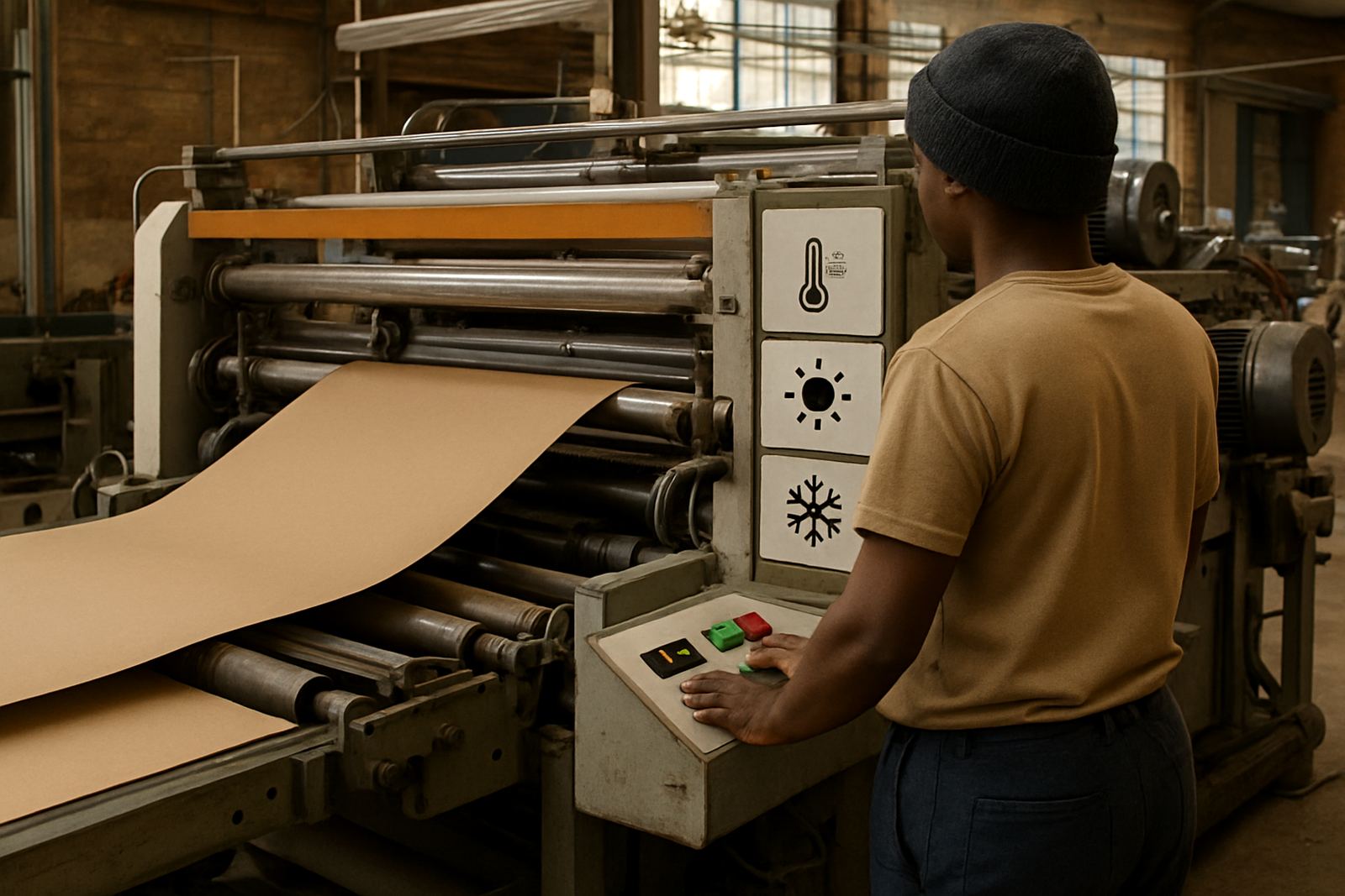
It also helps to think about who will read the pack first. A buyer in a supermarket wants fast reassurance. A distributor wants easy handling. A technician at a packaging converter wants print consistency and repeatable results. That is why the wording, symbol size, and colour choice should be checked at the same time as the print process, not after the first delivery. Small changes now save bigger trouble later, especially when a pack is run on different lines in Jacobs, Prospecton, or Johannesburg.
Good on-pack education should answer these points:
- What does the colour or symbol mean?
- What must the shopper do next?
- Is the change permanent or temporary?
- What happens if the cue is missing or damaged?
Testing the cue before it reaches shelves
Before a cue goes onto a full production run, it should be checked under real conditions. That includes adhesion, rub resistance, and how the mark behaves after folding, stacking, and time in transit. In coastal areas like Durban, moisture can affect how cleanly a printed cue reads. In inland towns, dust and dry air can change the way inks sit on film or board. A pack that looks fine on a light table may not survive a truck trip to Cape Town or Gqeberha.
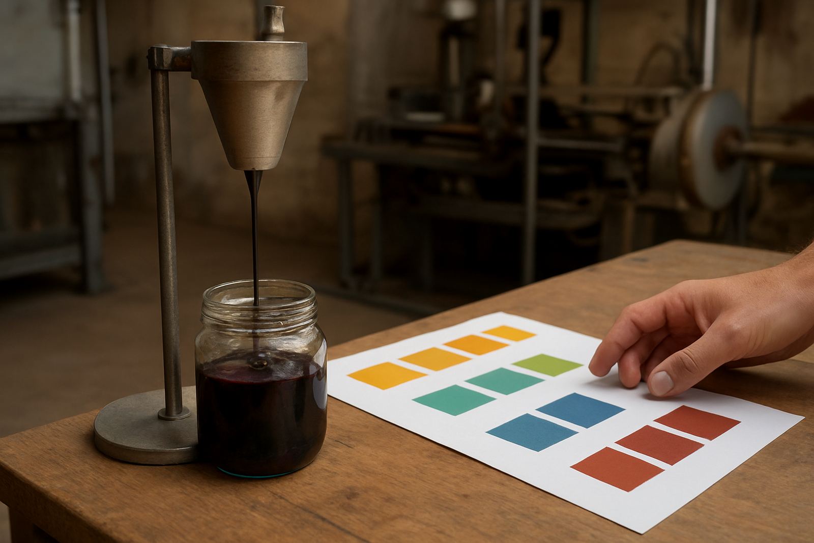
Practical testing also helps when a client needs a specific threshold. Some cues must change at a narrow temperature band and others need a broader response. If the message is too sensitive, it may trigger too early. If it is too slow, shoppers lose trust. Trial batches, drawdown panels, and press startup checks make it easier to confirm that the on-pack explanation matches the actual print response.
- Check the cue after 24 hours, not only straight off the press.
- Test samples from the start, middle, and end of a run.
- Include handling tests from warehouse to retail shelf.
- Keep retained samples so future batches can be compared if there is a query.
A Durban example of clear shopper guidance
Consider a chilled beverage pack going through a converter in Jacobs and then into distribution across KwaZulu-Natal. The pack uses a temperature cue on the label and a small symbol telling the shopper when the product is at the right serving condition. If the explanation is vague, buyers may think the colour shift means the product is spoiled. If the wording is clear, they understand it is a useful signal and not a fault.
The same logic applies to a security mark on a premium item sold through multiple outlets. A short line such as "Check for the hidden pattern before opening" gives the shopper a simple task. Staff can also use the same message when inspecting returned stock. That kind of clarity lowers confusion, supports trust, and makes the pack more useful from factory floor to store shelf.
For converters, the lesson is straightforward: the visual effect is only half the job. The other half is education, printed clearly and placed where it will actually be seen.
Keeping the message useful over time
Packaging should keep educating the shopper even after the pack has travelled, been handled, and stood on shelf for weeks. Sunlight, stacking, and repeated touching can dull a message if the layout is poor. That is why the wording, colour choice, and symbol size should be checked for the full life of the pack, not just the first day it leaves the press.
The strongest on-pack education is short, practical, and repeatable. If customers can understand it quickly, they are more likely to trust the product and buy again. If the message is confusing, the pack creates doubt. For South African businesses dealing with heat, humidity, and long supply chains, that difference matters every day.