

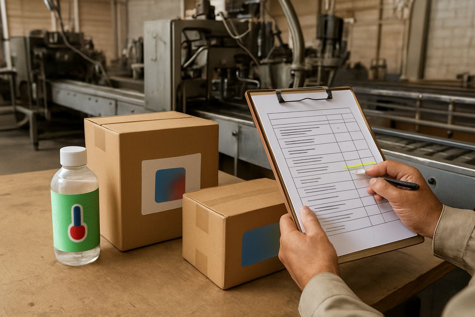
When packaging starts giving away the problem
Counterfeit risk is not always obvious at first. A pack may still look acceptable on a screen or under warehouse lights, but once it reaches stores, clinics or distributors the small faults start to stand out. In South Africa, where goods move through busy depots, long road routes and mixed storage conditions, those weak points can become a real opening for tampering or copying.
The first warning sign is inconsistency. If one batch has a slightly different shade, finish or panel alignment from the next, that gives counterfeiters room to pass off sub standard stock as genuine. It is also worth watching for packaging that is too easy to reproduce with standard print methods. Simple logos, plain backgrounds and common layouts are cheaper to copy, which is why higher risk products often need stronger visual and technical checks.
- Colour shifts between batches or between print runs
- Artwork that is too simple to distinguish from copied stock
- Packs that pass casual inspection but fail close comparison
- Repeated complaints about unsure origin from buyers or stores
Physical clues that the pack may not be genuine
Many counterfeit issues show up through handling. If a pouch rubs off easily, a carton scuffs too quickly, or a seal line looks uneven, that may point to rework or low grade copying. In humid coastal areas like Durban and Richards Bay, weak coatings can worsen quickly. In hot inland distribution lanes, print stability can change under heat and stacking pressure, so the true test is often what the pack looks like after transit, not just on day one.
Another warning sign is a mismatch between the pack and the product story. If a temperature sensitive item is sold in packaging with no clear visual cue, or if authentication marks are hidden in ordinary print areas, staff and consumers have no easy way to confirm what they are holding. That creates an opening for substitution, especially where stock is transferred between depots or moved in partial loads.
- Ink that rubs off during normal handling
- Seals, labels or overprints that lift at the edges
- Visual elements that fade after sun exposure or cold chain movement
- Product lines that rely only on a barcode for identity
If these signs appear often, the problem is usually bigger than print quality alone. It can mean the packaging has no effective second layer of protection.
Supply chain patterns that point to tampering
Counterfeit risk is not only about the pack itself. It also shows in the way stock moves. If losses, returns or complaints cluster around certain routes, depots or buyers, that pattern deserves attention. A converter in Jacobs might notice a customer in Gauteng reporting changed pack appearance only after bulk distribution through a third party warehouse. That does not always prove counterfeit stock, but it tells you where to look first.
There are practical signs that the authentication system is too weak for the current risk level. These include frequent relabelling, shared packaging across multiple product types, and stock that leaves the factory without a clear batch trace. Once that happens, a copied pack can sit in the market for months before anyone spots it.
- Returns from the same route or customer segment
- Batch details that are hard to trace after dispatch
- Multiple pack versions in circulation at once
- Stock that changes hands several times before sale
For packaging converters, this is where review is useful. If a product is going nationwide, the pack has to survive handling in Durban heat, inland dust and long haul transport without losing its identity.
Why simple print is often not enough
Basic print can carry a brand message, but it may not stop a determined copier. Counterfeiters look for the easiest route, and plain graphics are often the first target. If your packaging only relies on a logo, colour block or generic text, you may need stronger authentication layers such as colour changing features or security patterns that are harder to duplicate with standard equipment.
Thermochromic elements add value where a product needs a visible temperature cue, while security inks help create marks that are harder to copy accurately. Used properly, these features do not just make the pack look different. They give staff, distributors and consumers a quick check that supports authenticity. The best results come when the feature is planned around the product, the substrate and the print process, not added at the last minute.
- Temperature sensitive indicators for chilled or heat exposed items
- Security patterns that are difficult to reproduce cleanly
- Ink systems matched to the substrate and finishing method
- Authentication marks that are easy to train staff on
How to decide if stronger authentication is needed
Not every product needs the same level of protection. The higher the risk, the more important it is to use a clear checklist. Items with strong brand pull, repeated tampering complaints, high resale value or regulated use should be reviewed first. So should packs that move through many hands before they reach the final customer.
A good review starts with the real pack, not just the artwork file. Test print samples, press conditions and substrate choice all matter. Ask whether the pack still looks correct after abrasion, whether the mark survives storage, and whether a store assistant can verify it in under 10 seconds. If not, the authentication system may be too weak for daily use.
Useful questions to ask:
- Can the pack be copied with normal commercial printing methods?
- Does the current design show batch changes clearly enough?
- Will the mark still be visible after rubbing, stacking or moisture exposure?
- Can staff in distribution and retail use it without special equipment?
If the answer is no to more than one of these, it is time to look at stronger measures.
A Durban example: when the warning signs lined up
A packaging line serving frozen and temperature sensitive goods in Durban South started seeing mixed complaints from trade buyers. Some packs were arriving with slightly different colour tones, and a few cartons showed faint rub marks after a short trip from Jacobs to inland depots. At first it looked like a handling issue, but the same questions kept coming back from different customers.
Once the converter compared old and new batches, the risk picture became clearer. The pack had no strong visual authentication cue, and the print was simple enough to imitate. A combination of colour matching, threshold tuning and a security pattern plan helped tighten the line. The goal was not only to improve appearance, but to make copying harder and checking easier for the people receiving stock.
That is the main lesson. Counterfeit risk usually announces itself through a few small signs, then repeats them. The earlier those signs are treated as a packaging problem, the easier it is to protect the product and the supply chain.
- Repeated colour variation across batches
- Complaint patterns from the same route or buyer group
- Packaging that lacks a clear authenticity cue
- Signs of wear that appear too early in normal transport
What a practical response should look like
Once the risk is clear, the response should be direct. Review the artwork, the substrate, the finishing method and the authentication layer together. Run drawdowns, check adhesion, test rub resistance and verify how the mark behaves under light, heat and transit. If the pack is going to market across provinces, it should be tested under conditions that reflect the real journey, not just the pressroom.
For South African businesses, that usually means thinking about storage heat, coastal humidity, long haul transport and the way municipal or retail buyers inspect stock. A stronger authentication setup does not need to be complicated, but it does need to be consistent. When the warning signs are visible, delay can cost far more than a test run. Small issues grow quickly once copied stock enters circulation.
Teams that work with packaging converters can also keep a retain library for later comparison. That makes it much easier to spot changes early and keep the line under control.